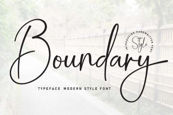
Boundary: A Timeless Handwritten Font for Digital Branding
It started with a hero section. I was redesigning a boutique coaching site—clean, intentional, warm—and needed a headline font that felt human but never sloppy. Not too playful, not too formal. Just… present. I loaded Boundary into my Figma file, typed “Your Next Chapter Starts Here,” and paused. The letters leaned in just enough—like someone speaking softly across a table. No sharp edges, no forced flourishes. Just quiet confidence. That’s when I knew this wasn’t just another script font—it was a digital tone-of-voice tool.
What Makes Boundary Shine on Screen
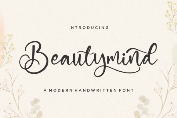
Boundary is a premium handwritten font from the Script Amp category—designed not for mimicry, but for resonance. It’s not calligraphic, not brush-based, not overly connected. Instead, it breathes like real handwriting: subtle entry and exit strokes, gentle variations in stroke weight, and a rhythm that invites the eye to linger—not stumble. On a high-resolution display, each character feels considered. The lowercase a has a soft, open bowl; the g curls with intention; the t crosses with a delicate upward flick. There’s warmth without whimsy, elegance without distance.
I tested it across devices: desktop, tablet, and iPhone. At 48px on a hero banner, Boundary held its charm—even over a softly blurred background image. At 32px on a mobile landing page headline? Still legible, still expressive. But I quickly learned its sweet spot: short, meaningful phrases. “Welcome,” “Begin,” “Belong,” “Create.” Anything longer than six words began to soften the message rather than strengthen it. That’s not a flaw—it’s clarity of purpose. Boundary is a display font, not body copy. And that distinction matters in web design.
Where Boundary Elevates Real Digital Projects
In practice, Boundary works beautifully where personality meets purpose:
- Landing page headlines—especially for creative services, wellness offerings, or small-batch digital products. Paired with a clean sans serif (I used Inter at 18px for body), it creates instant hierarchy and emotional contrast.
- Section dividers and subheadings—like “How It Works” or “What You’ll Receive”—where you want rhythm without repetition.
- Call-to-action buttons (when styled thoughtfully): “Start Now,” “Join the List,” “Get the Guide.” I kept button text at 20px max, always with ample padding and high-contrast backgrounds—no transparency overlays.
- Branded graphics for social or email: newsletter headers, Instagram story highlights, or PDF lead magnets. Its natural flow translates well into static PNGs and SVG exports.
- Digital brand kits: Boundary became the anchor for a client’s visual identity system—used consistently for logo lockups, presentation titles, and signature email footers.
It also performed surprisingly well in dark mode—especially with a subtle letter-spacing adjustment (+0.5px) and slightly increased line-height. No shimmer, no rendering hiccups. Just calm, consistent presence.
Readability & Responsiveness: What to Watch For
Boundary isn’t built for dense interfaces. I tried it in a navigation bar (16px, uppercase)—and while it looked lovely on hover, scanning became slower. Same for form labels or footer links: legibility dropped below 18px on most screens. So I reserved it strictly for high-impact, low-frequency moments—places where users pause, not skim.
Mobile responsiveness required one small tweak: I added a @media (max-width: 768px) rule to scale the font down to 36px (from 48px) and increased tracking by 1px. This preserved spacing and avoided cramped connections between letters—a common issue with script fonts on smaller viewports.
For accessibility, I paired Boundary only with WCAG-compliant sans serifs (like Open Sans or Manrope) for all supporting text. And crucially—I never used it for alt text, ARIA labels, or any non-decorative function. Its role is visual storytelling, not information delivery.
Smart Pairing + Practical Licensing Notes
Boundary sings when balanced. My go-to pairing? Manrope (a friendly, highly readable sans serif) for everything functional—body text, captions, navigation, forms. The contrast is immediate: human warmth meets quiet reliability. For more editorial sites, I’ve paired it with Playfair Display—using Boundary for pull quotes and Playfair for article headings—creating layered sophistication.
Before deploying, I checked what came in the download: OTF and WOFF2 files (perfect for web), stylistic alternates (including a cleaner ‘t’ and simplified ‘&’), and basic multilingual support (Latin Extended-A). No variable font axis—but the single weight is thoughtfully tuned for screen use. Most importantly, the commercial license explicitly covers web embedding, SaaS dashboards, and client projects—no hidden restrictions.
When to Reach for Boundary—and When to Pause
Reach for Boundary when you’re designing:
- A portfolio homepage that needs soul, not sterility
- A course sales page where trust and approachability matter more than speed
- A boutique online store banner that introduces a seasonal collection
- A digital brand kit meant to feel handcrafted, not templated
- A blog header that signals voice before a single word is read
Pause before using it for:
- Long-form blog content or documentation
- Navigation menus or complex dashboard labels
- Small-screen UI elements under 16px
- Any context where rapid scanning or precise comprehension is critical
Boundary doesn’t shout. It leans in. And in a digital landscape full of noise, that kind of quiet confidence is rare—and deeply effective.